
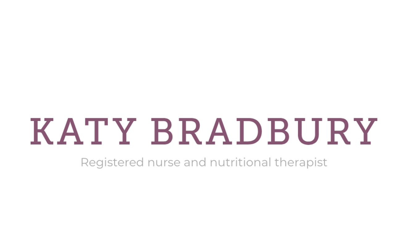
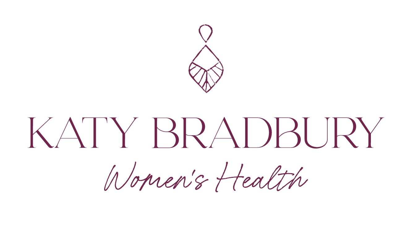
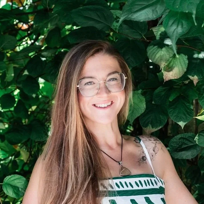
Katy Bradbury
Women’s Health Specialist
HOW IT STARTED
When Katy first came to me, she was in an important moment of evolution.
Publicly, she was known as a nutritional therapist specialising in fertility… but her work had outgrown that label. Her ethos had shifted, deepened, expanded. She no longer wanted to be seen simply as “the fertility person” her vision was far bigger.
In our initial calls, Katy talked about being a leading voice for women, a space holder - someone who helps women reclaim their health, their voice, and their divine femininity.
She wanted her brand to honour the full spectrum of her work: connection to the natural world, the wisdom of our cycles, embodied healing, intuitive leadership, and her desire to move into group programmes, workshops, circles, and retreats.
But her branding didn’t reflect any of this.
It felt clinical, junior, and rooted in her previous identity. It didn’t capture the depth or grounded power that her clients feel when they work with her… and it certainly didn’t match where she wanted to grow.
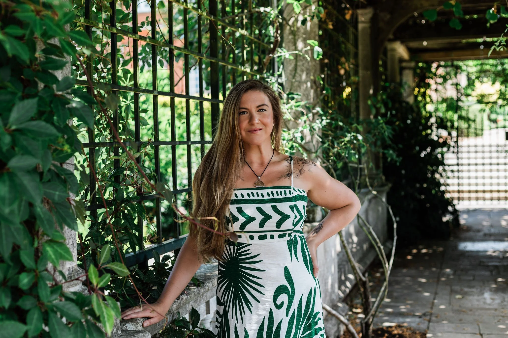
She needed a brand that felt true. Rooted. Raw. Feminine-but-strong.
A brand that expressed everything her words tried to say - even the things she couldn’t articulate yet.

WHAT WE DID
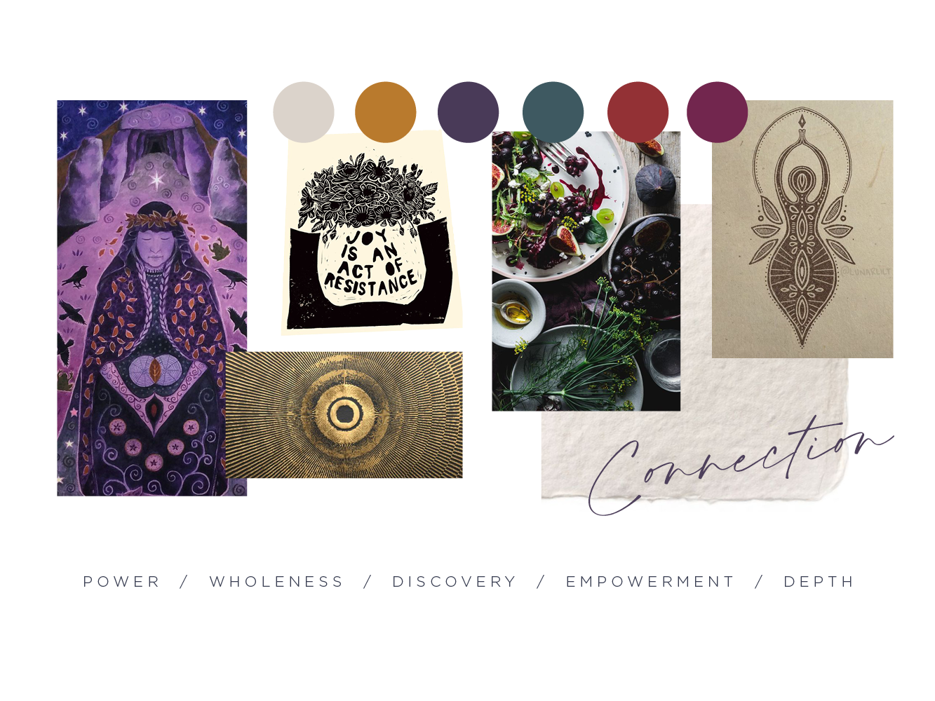
Katy’s brand needed to feel powerful - but not loud. It needed to feel feminine, but not cliché. It had to express the depth and intuition in her work while holding the strength and wisdom she brings to the women she supports.
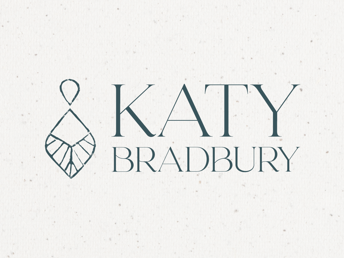
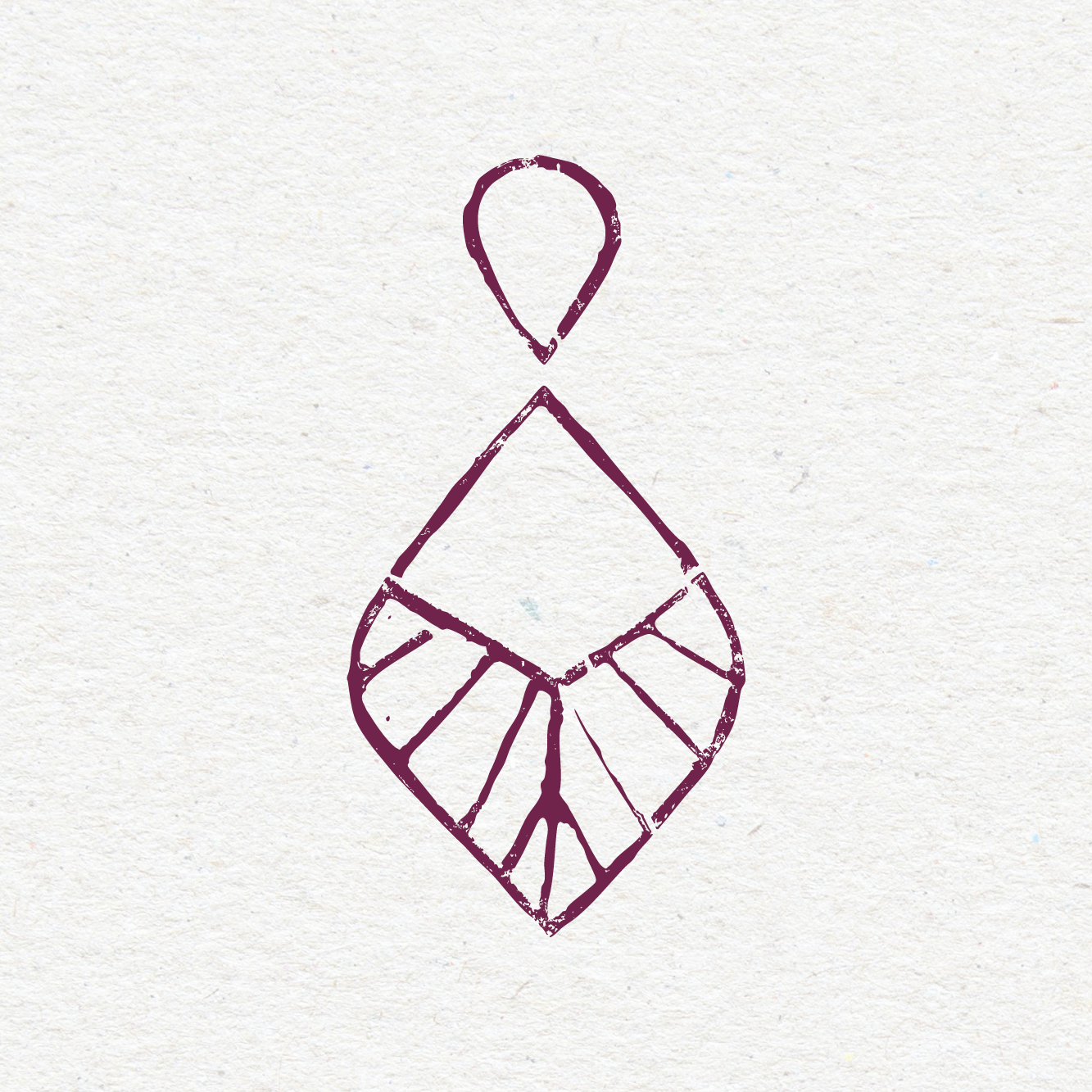
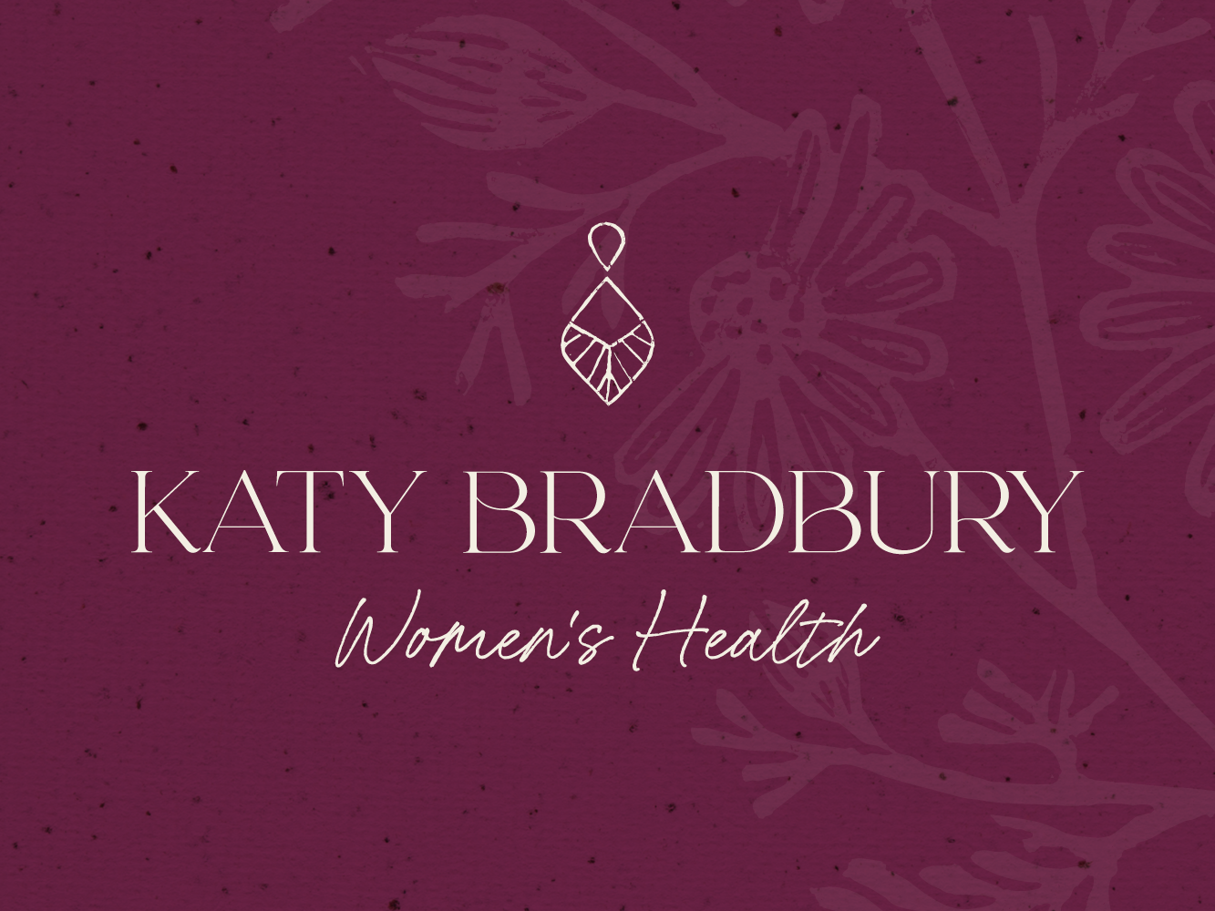
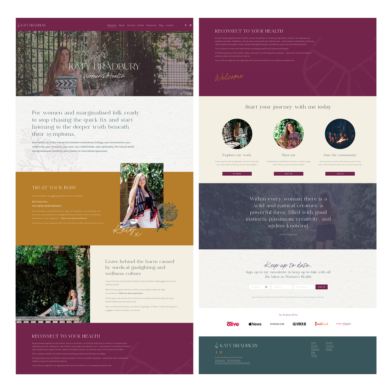
At the heart of the identity is an icon inspired by ancient goddess symbols - forms traditionally used to represent womanhood, earth connection, intuition, and cyclical living.
The icon blends the silhouette of an ancient goddess with the shape of a leaf and water droplet - symbolising feminine wisdom, nourishment, and new beginnings. Simple yet deeply symbolic, it expresses the inner strength and restorative power at the heart of Katy’s work.
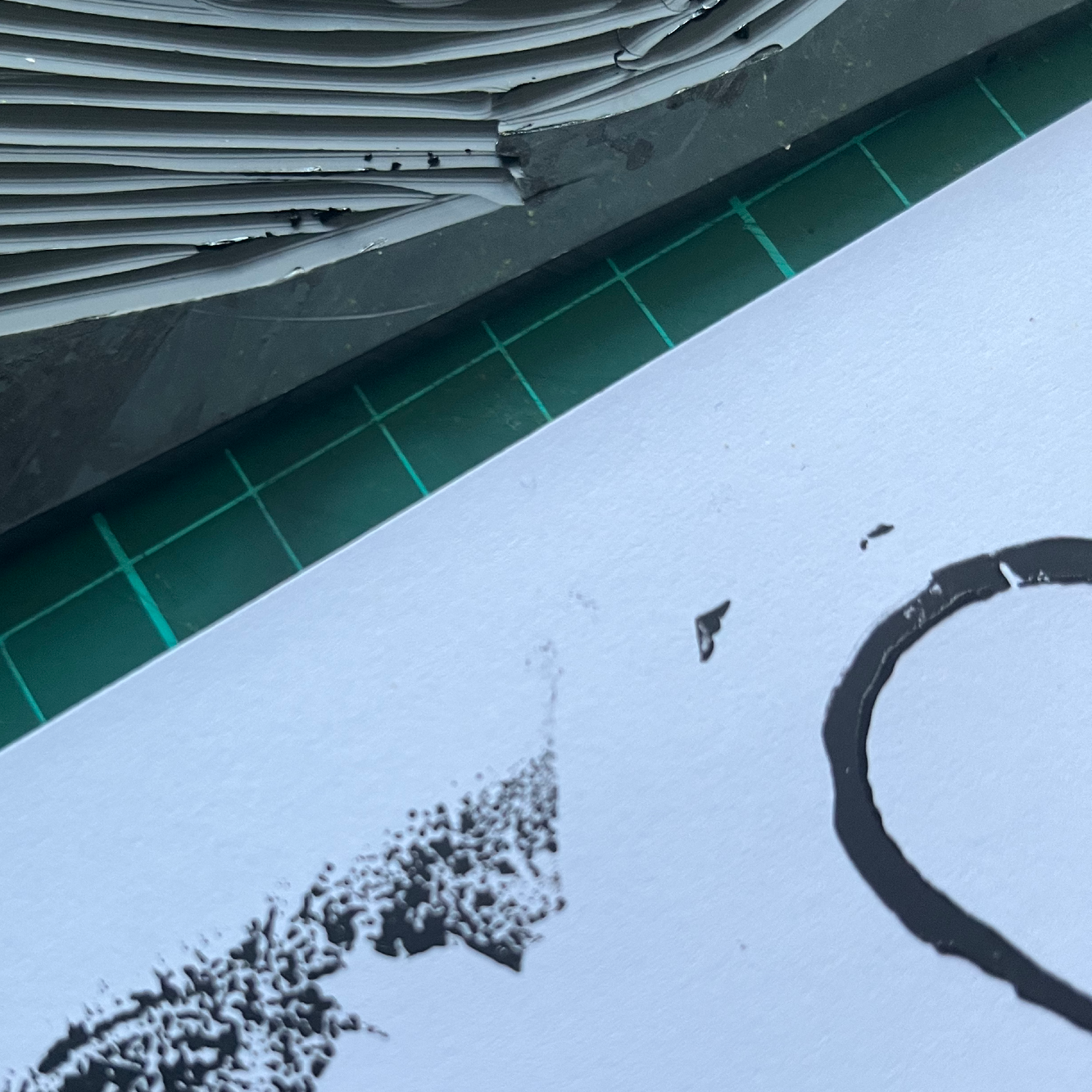
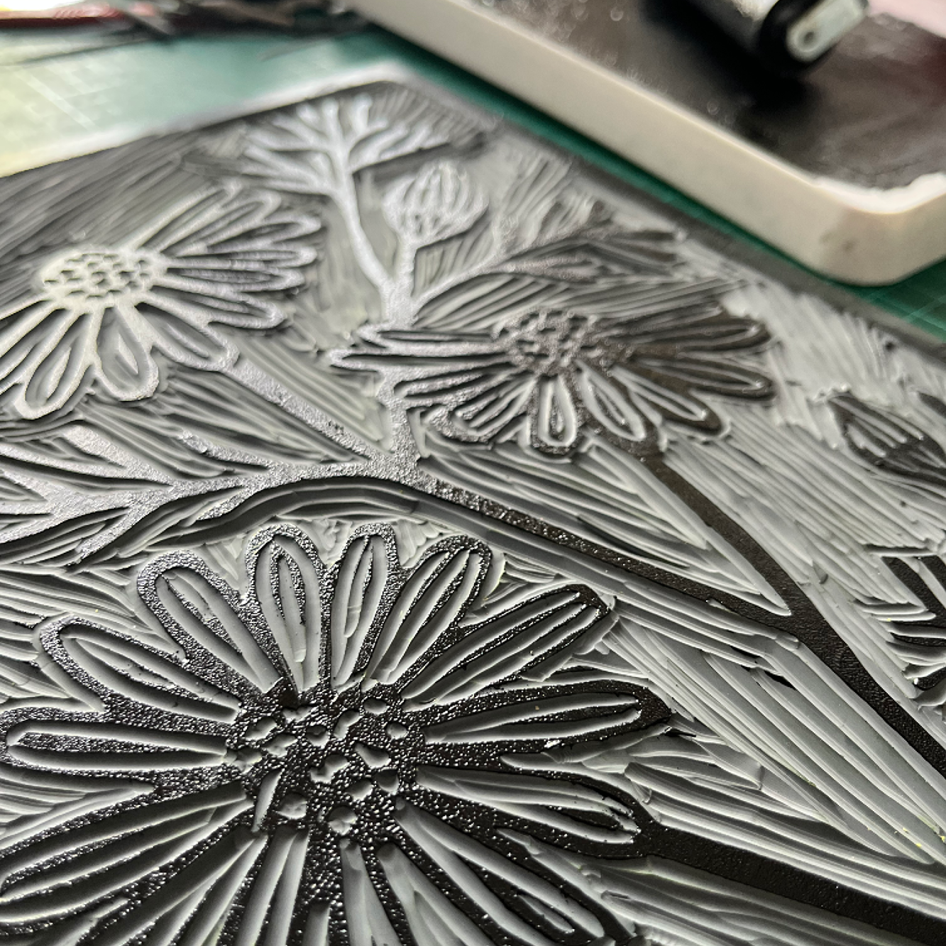
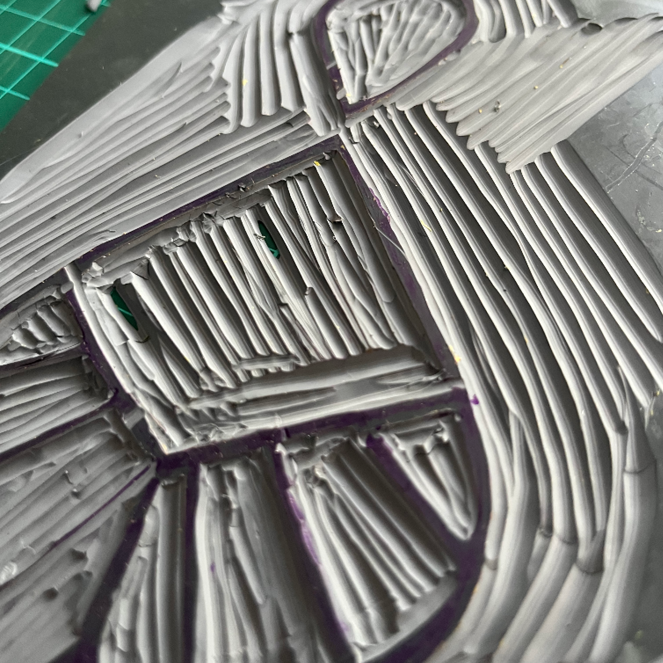
To avoid a “perfect” digital feel, we translated the mark through lino cutting, embracing the natural imperfections and asymmetry that gave the brand depth and soul.
The typographic logo was crafted to honour Katy’s duality: gentle and grounded, yet wise and deeply impactful. The spacing and elegance bring calm clarity - exactly the energy Katy’s clients feel when they work with her.
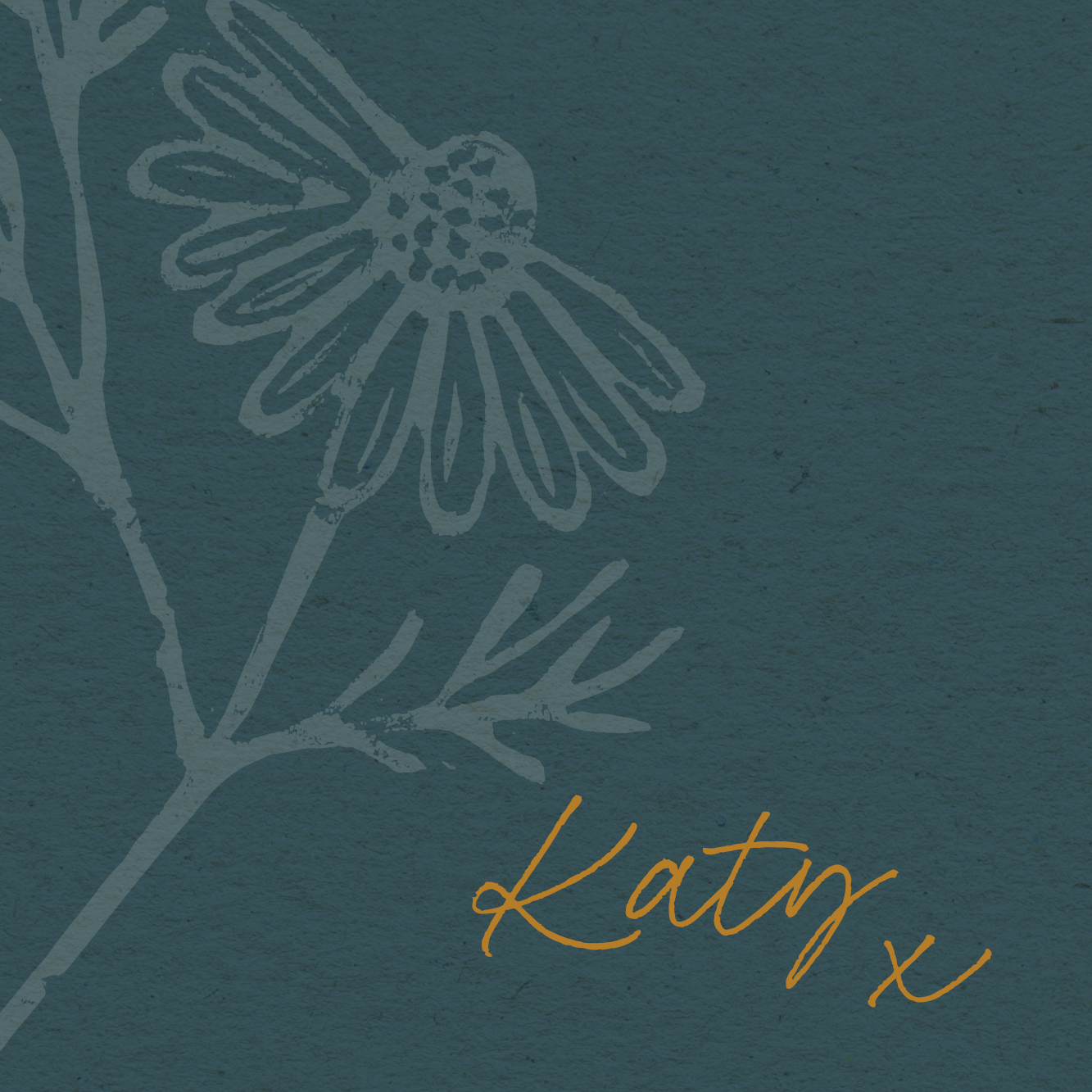
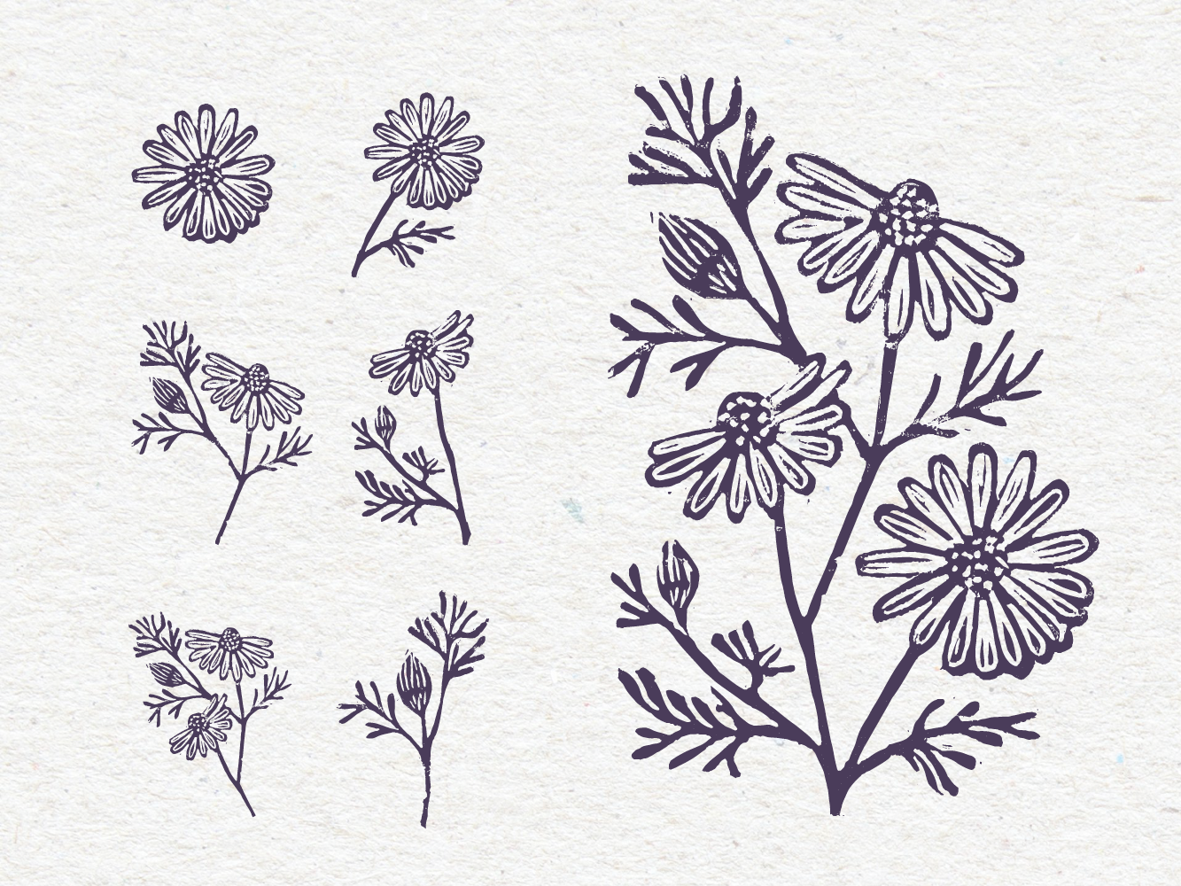
To deepen the connection to cycles, nature, and the wisdom of our bodies, we created a set of hand-carved chamomile lino prints - the perfect botanical symbol for grounded femininity, emotional regulation, and the quiet power of nature.
These textured prints bring honesty and authenticity to the brand - slowing down and creating real marks made by hand.
A mirror to Katy’s own work: rooted, human, intuitive, real.
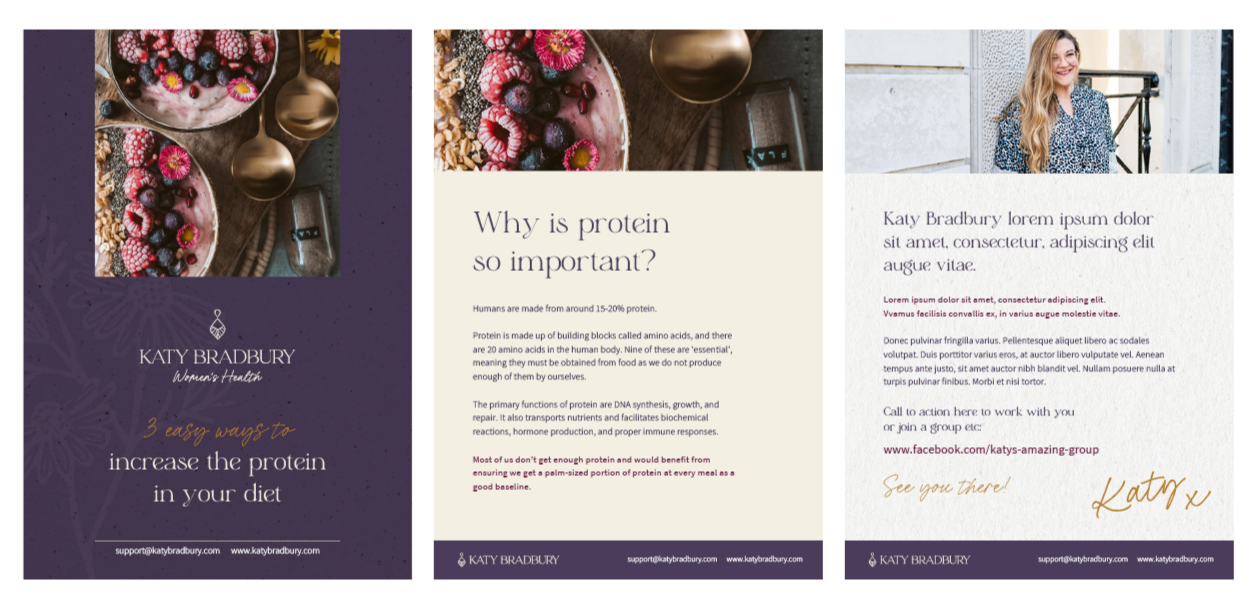
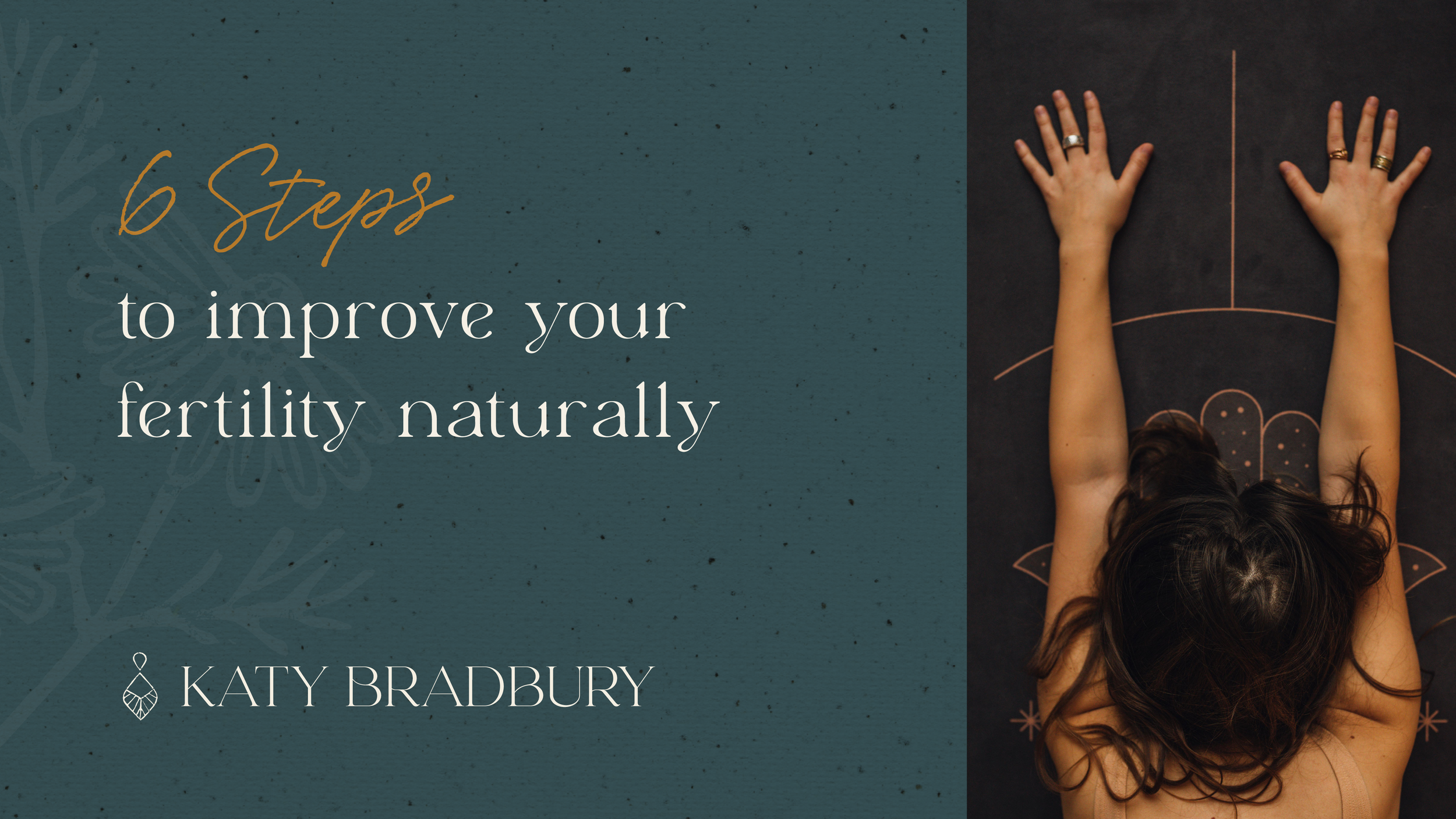
Everything came together through a naturally inspired colour palette, organic textures, and a warm photography direction that felt real - not clinical.

AND THE RESULTS...
The final identity feels powerful yet gentle, grounded yet elevated - exactly the space Katy holds for her clients.
A brand aligned with where she’s going.
Katy recently signed a client from the other side of the world who said that as soon as she landed on Katy’s website, she knew she was the right person to help her.
“You tapped into a part of myself I had never realised was so integral to my brand.”
“I feel excited, aligned, and ready to step into this new chapter.”
“My brand now reflects the real depth of my work.”
Her new brand made her feel fully seen — not just as a practitioner, but as a woman, a leader, and a guide.


What Katy says…
You have been able to see something inside my head that I’ve almost known was in there. I’ve been able to use words to describe it and you have taken those words and given a very powerful visual image that made me go ‘holy f*** yes, that’s it!’ I would never have been able to get to that.
The branding feels raw, honest, powerful… and completely me.
I feel proud, aligned, and excited to move forward in my business.
I loved the whole process — it was eye-opening, supportive, and deeply grounding.